- 本文链接:VitePress 集成 Ant Design Vue 记录
- 版权声明: 本博客所有文章除特别声明外,均采用
BY-NC-SA 许可协议,转载请注明出处!
VitePress 集成 Ant Design Vue 记录
2025/2/16大约 4 分钟
VitePress 集成 Ant Design Vue 记录
近期使用 VitePress 重构了下公司的 API 文档官网,UI使用的是 Ant Design Vue,记录下所遇到的问题,毕竟好记性不如烂笔头。
添加 vite.config.ts
.vitepress/config.ts 文件中是支持 Vite 相关配置的,个人更倾向于将 vite.config.ts 文件放在项目的根目录,此时可以设置 configFile 为 vite.config.ts,然后在根目录添加 vite.config.ts 文件即可。
import { defineConfig } from 'vitepress'

// https://vitepress.dev/reference/site-config
export default defineConfig({
  // ...其他配置
  vite: {
    configFile: 'vite.config.ts'
  },
})import { defineConfig } from 'vite'
export default defineConfig({
// vite 相关配置
})集成 Ant Design Vue
安装依赖
- 安装
ant-design-vue
pnpm add ant-design-vue@4.x- 安装
unplugin-vue-components
pnpm add unplugin-vue-components -D配置 vite.config.ts
import path from 'node:path'
import Unocss from '@unocss/vite'
import { AntDesignVueResolver } from 'unplugin-vue-components/resolvers'
import Components from 'unplugin-vue-components/vite'
import { defineConfig } from 'vite'

export default defineConfig({
  // vite 相关配置
  plugins: [
    Components({
      resolvers: [
        AntDesignVueResolver({
          importStyle: false, // css in js
        }),
      ],
      // 指定自动生成的components.d.ts位置
      dts: path.resolve(__dirname, './types/components.d.ts'),
      // 设置自动引入的components目录
      dirs: [path.resolve(__dirname, './src/.vitepress/theme/components')],
    }),
  ],
})
定制主题
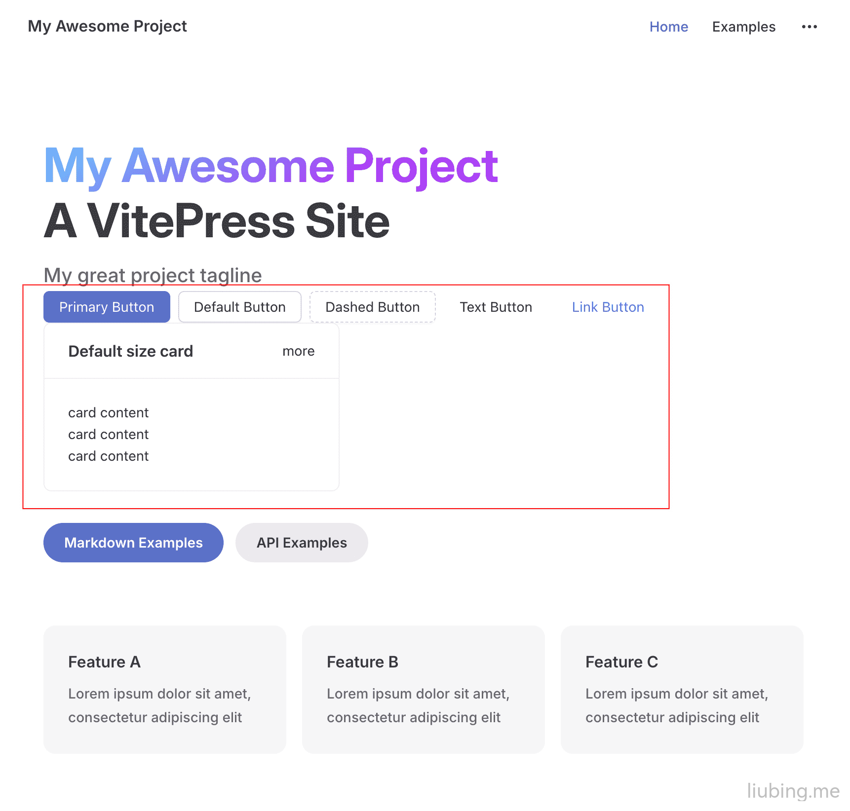
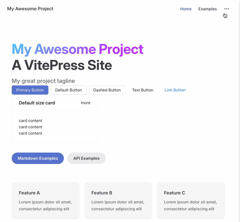
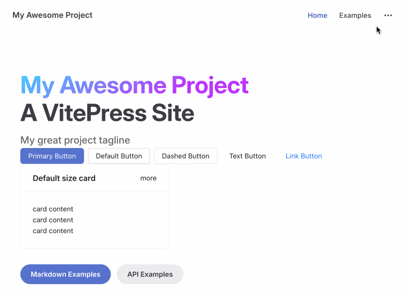
定制主题等相关内容需要使用到 a-config-provider,需要我们自定义一个 Layout 布局继承原主题,使用插槽添加点组件测试下。
<template>
  <AConfigProvider :theme="themeConfig">
    <Layout>
      <!-- 支持的插槽:https://vitepress.dev/zh/guide/extending-default-theme#layout-slots -->
      <template #home-hero-info-after>
        <!-- 添加点组件测试下 -->
        <ASpace wrap style="margin: auto">
          <AButton type="primary">
            Primary Button
          </AButton>
          <AButton>Default Button</AButton>
          <AButton type="dashed">
            Dashed Button
          </AButton>
          <AButton type="text">
            Text Button
          </AButton>
          <AButton type="link">
            Link Button
          </AButton>
        </ASpace>
        <ACard title="Default size card" style="width: 300px">
          <template #extra>
            <a href="#">more</a>
          </template>
          <p>card content</p>
          <p>card content</p>
          <p>card content</p>
        </ACard>
      </template>
    </Layout>
  </AConfigProvider>
</template>

<script lang="ts" setup>
import { ThemeConfig } from 'ant-design-vue/es/config-provider/context'
import DefaultTheme from 'vitepress/theme'
import { computed } from 'vue'

const { Layout } = DefaultTheme // 默认的主题布局
const themeConfig = computed((): ThemeConfig => {
  return {
    token: {
      colorPrimary: '#5672cd'
    }
  }
})
</script>
如果能够出现 Ant 组件说明就 OK 了。
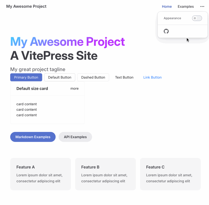
适配暗黑模式
参考预设算法,暗黑模式需要设置 algorithm 为 theme.darkAlgorithm,是否是暗黑模式可以通过 useData() 中 isDark 获取。
<script lang="ts" setup>
import { theme } from 'ant-design-vue'
import { ThemeConfig } from 'ant-design-vue/es/config-provider/context'
import { useData } from 'vitepress'
import DefaultTheme from 'vitepress/theme'
import { computed } from 'vue'

const { Layout } = DefaultTheme // 默认的主题布局
const { isDark } = useData()
const themeConfig = computed((): ThemeConfig => {
  return {
    token: {
      colorPrimary: '#5672cd'
    },
    // 暗黑模式isDark的时候使用darkAlgorithm算法
    algorithm: isDark.value ? theme.darkAlgorithm : theme.defaultAlgorithm
  }
})
</script>
切换暗黑模式测试下。
异常处理
打包异常
本地运行的时候都一切正常,打包的时候会报错组件找不到,如下所示:
Named export 'Button' not found. The requested module 'ant-design-vue/es/index.js' is a CommonJS module, which may not support all module.exports as named exports.
CommonJS modules can always be imported via the default export, for example using:

import pkg from 'ant-design-vue/es/index.js';
const { ConfigProvider, Space, Button, Card } = pkg;
此时需要设置 ssr.noExternal 即可正常打包。
export default defineConfig({
  // vite 相关配置
  ssr: {
    noExternal: [
      'ant-design-vue',
      '@ant-design/icons-vue',
      '@ant-design/icons-svg',
    ],
  },
})
样式闪烁
本地运行的时候都是一切正常的,打包后访问会有样式闪烁.
尝试过文档中的SSR 静态样式导出,但是生成的 css 文件非常大,看着像是全量的样式,而且引入后也没效果,也不知道是不是使用方式不对,有知道的大佬可以评论指导下。
最后使用取巧的方法也能完美解决,默认给 .Layout 设置 opacity: 0,在 onMounted 的时候再延迟设置 opacity: 1,配合 transition 动画过渡下效果也很完美。
<template>
  <!-- 内容省略... -->
</template>

<script lang="ts" setup>
// ...其他内容

onMounted(() => {
  const $layout = document.querySelector<HTMLElement>('.Layout')
  if ($layout) {
    setTimeout(() => {
      $layout.style.opacity = '1'
    }, 150)
  }
})
</script>

<style>
.Layout {
  opacity: 0;
  transition: opacity 0.15s;
}
</style>
暗黑模式刷新组件异常
本地开发都是正常的,但是打包后访问,可以发现暗黑模式切换的时候都是正常的显示,但是处于暗黑模式刷新页面的时候组件样式都丢失了。
自己研究了下发现暗黑模式刷新后组件的 class 后缀还是亮色模式的。
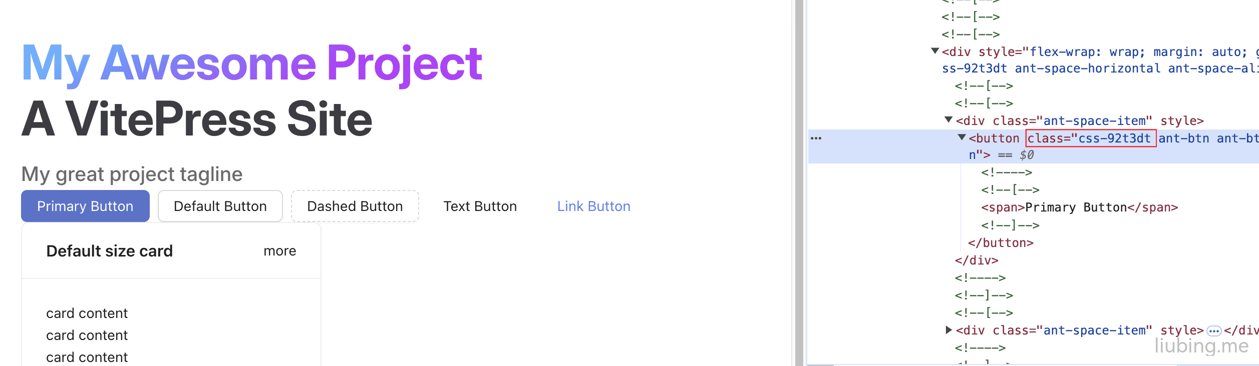
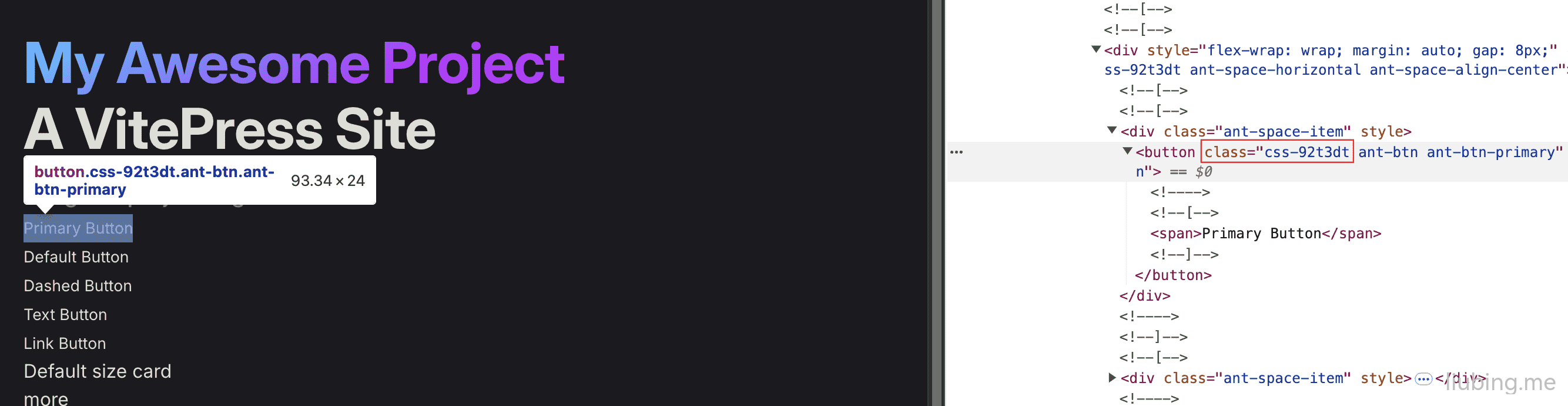
下面是正常的暗黑模式组件 class:
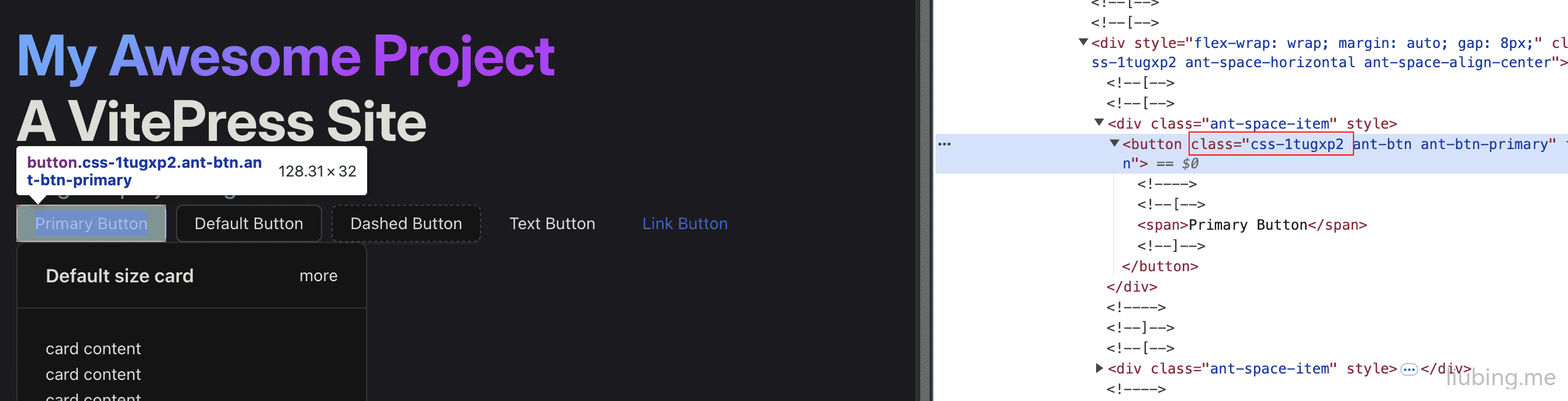
盲猜大致是暗黑模式对于组件是没生效的缘故,可能是设置 algorithm 的时机不对,最后改成在 onMounted 中 watch 监听暗黑模式 isDark 切换动态设置 algorithm 即可。
<template>
  <!-- 内容省略... -->
</template>

<script lang="ts" setup>
import { theme } from 'ant-design-vue'
import {
  MappingAlgorithm,
  ThemeConfig
} from 'ant-design-vue/es/config-provider/context'
import { useData } from 'vitepress'
import DefaultTheme from 'vitepress/theme'
import { computed, onMounted, ref, watch } from 'vue'

const { Layout } = DefaultTheme // 默认的主题布局
const { isDark } = useData()
const algorithm = ref<MappingAlgorithm>(theme.defaultAlgorithm)
const themeConfig = computed((): ThemeConfig => {
  return {
    token: {
      colorPrimary: '#5672cd'
    },
    algorithm: algorithm.value
  }
})

onMounted(() => {
  // 监听暗黑模式切换
  watch(
    isDark,
    (value) => {
      // 动态设置algorithm
      algorithm.value = value ? theme.darkAlgorithm : theme.defaultAlgorithm
    },
    { immediate: true }
  )
  const $layout = document.querySelector<HTMLElement>('.Layout')
  if ($layout) {
    setTimeout(() => {
      $layout.style.opacity = '1'
    }, 150)
  }
})
</script>

<style>
.Layout {
  opacity: 0;
  transition: opacity 0.15s;
}
</style>
这样暗黑模式就算是 OK 了。
 Cloudflare
 1Panel
 VuePress
 VuePress Theme Hope