- 本文链接:Ant Vue 1.x 动态自定义换肤
- 版权声明: 本博客所有文章除特别声明外,均采用
BY-NC-SA 许可协议,转载请注明出处!
Ant Vue 1.x 动态自定义换肤
2023/2/4大约 13 分钟
Ant Vue 1.x 动态自定义换肤
由于项目老平台使用的 UI 框架是 Ant Vue 1.x 的版本,首先考虑的就是官方自己的Pro Admin平台的方案,由于 Ant Admin 的方案只支持了主题色换肤,而内容项目平台是需要支持多种颜色换肤,如主题色、各个功能色,超链接等颜色换肤。既然官方的 Admin 平台支持换肤,咱们就去具体研究下怎么实现的,既然支持一种那应该也支持多种颜色的换肤的。
前期研究
通过阅读代码可以定位到侧边栏功能的代码:点击去查看,里面可以找到主题色字样。
通过代码就可以知道切换颜色的时候调用的是 themeColor 里面的 changeColor 方法,可以看下 themeColor 里面的代码:
import client from 'webpack-theme-color-replacer/client'
import generate from '@ant-design/colors/lib/generate'

export default {
  getAntdSerials(color) {
    // 淡化(即less的tint)
    const lightens = new Array(9).fill().map((t, i) => {
      return client.varyColor.lighten(color, i / 10)
    })
    // colorPalette变换得到颜色值
    const colorPalettes = generate(color)
    const rgb = client.varyColor.toNum3(color.replace('#', '')).join(',')
    return lightens.concat(colorPalettes).concat(rgb)
  },
  changeColor(newColor) {
    var options = {
      newColors: this.getAntdSerials(newColor), // new colors array, one-to-one corresponde with `matchColors`
      changeUrl(cssUrl) {
        return `/${cssUrl}` // while router is not `hash` mode, it needs absolute path
      }
    }
    return client.changer.changeColor(options, Promise)
  }
}通过client.changer.changeColor 最终知道使用的是webpack-theme-color-replacer插件,这样我们就可以去研究下该插件了。
插件介绍
通过插件的基本使用介绍和 Google 搜索了解了下各配置的基本意思:
const ThemeColorReplacer = require('webpack-theme-color-replacer')

module.exports = {
  // ..... other config
  plugins: [
    new ThemeColorReplacer({
      matchColors: ['#ed4040', '#4b0', '255,80,80', '27, 92.531%, 52.745%'], // colors array for extracting css file, support rgb and hsl.
      fileName: 'css/theme-colors-[contenthash:8].css', //optional. output css file name, suport [contenthash] and [hash].
      // resolveCss(resultCss) { // optional. Resolve result css code as you wish.
      //     return resultCss.replace(/#ccc/g, '#eee')
      // },
      externalCssFiles: ['./node_modules/element-ui/lib/theme-chalk/index.css'], // optional, String or string array. Set external css files (such as cdn css) to extract colors.
      // changeSelector(selector, util) { // optional, Funciton. Changing css selectors, in order to raise css priority, to resolve lazy-loading problems.
      //     return util.changeEach(selector, '.el-button--default')
      // },
      injectCss: false, // optional. Inject css text into js file, no need to download `theme-colors-xxx.css` any more.
      isJsUgly: process.env.NODE_ENV !== 'development' // optional. Set to `true` if your js is uglified. Default is set by process.env.NODE_ENV.
    })
  ]
}matchColors:配置插件匹配的颜色,后面会根据匹配的颜色进行新颜色替换fileName:生成的 css 文件名,换色的时候会自动加载该 css 覆盖原有的颜色样式externalCssFiles:大致意思就是如果有加载外部的 css 可以通过该参数指定,来提取里面匹配的颜色changeSelector:用于改变样式选择器,解决样式覆盖问题,后面会有说明。injectCss:是否使用内联样式,如果设置 true 的话就不会引入 fileName 配置的 css 文件,而是在 body 下面插入覆盖样式的 style 内容,可以解决路由跳转导致的样式丢失问题。isJsUgly:暂时不明有啥作用
插件原理
通过 Google 搜索和研究该插件的Demo后,大致知道了基本原理,就是根据插件配置的 matchColors,在进行颜色变更的时候传入和配置的 matchColors 保持顺序一致的新颜色 newColors,插件会根据颜色匹配到样式文件中相应的 class 样式,从而根据该样式重新生成一套新的 style 样式覆盖原有的样式。
总结成一句话就是先配置需要变换的颜色 matchColors 参数,在换色的时候调用插件提供的 changeColor 方法传入 newColors 即可。
插件思考
回头想想,在 Ant 中一种颜色会对应不同的各个颜色,比如一个主色 mainColor,在按钮中会有 N 多个颜色,比如鼠标悬停色、鼠标点击后颜色,Loading 加载状态的颜色等等,这些颜色都是同一个色系的,咱们目前也不知道具体有多少个同色系色值,也不太可能一个个去找,但是我们知道这些色值应该是有一套自己的生成规律的。这时候我们再看这块代码就能明白了。
import client from 'webpack-theme-color-replacer/client'
import generate from '@ant-design/colors/lib/generate'
export default {
getAntdSerials(color) {
// 淡化(即less的tint)
const lightens = new Array(9).fill().map((t, i) => {
return client.varyColor.lighten(color, i / 10)
})
// colorPalette变换得到颜色值
const colorPalettes = generate(color)
const rgb = client.varyColor.toNum3(color.replace('#', '')).join(',')
return lightens.concat(colorPalettes).concat(rgb)
},
changeColor(newColor) {
var options = {
newColors: this.getAntdSerials(newColor), // new colors array, one-to-one corresponde with `matchColors`
changeUrl(cssUrl) {
return `/${cssUrl}` // while router is not `hash` mode, it needs absolute path
}
}
return client.changer.changeColor(options, Promise)
}
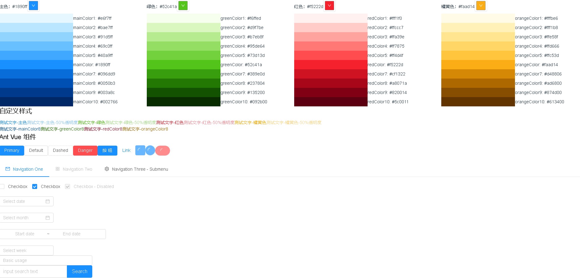
}getAntdSerials 方法就很关键,通过传入一个色值,调用@ant-design/colors 插件提供的 generate 方法,生成一个从浅到深的同色系色值列表,因为 Ant 中颜色有使用 Less 的 lighten 和 fade 方法,所以额外处理了淡化色值 lightens 和 rgb 色值,通过这些组成一个颜色的一套色值。因为项目需求是多个颜色的变换,所以我们可以生成多个颜色的色值组合列表形成一个总的列表。
PS:下图是该插件内置的色系。
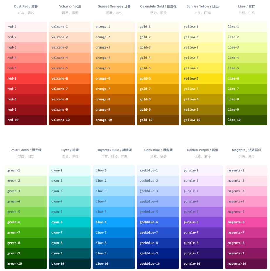
衍生色系
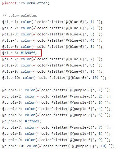
从上图中我们可以知道 generate方法 可以将 1 个颜色衍生出从浅到深的 10 个颜色,通过研究代码,可以发现 Ant 在 Less 中也实现了一套该方法,具体参考 colors.less,里面的每个颜色都是根据一个序号为 6 的颜色,根据 colorPalette 方法生成了一套颜色,然后根据其默认的主题文件,就知道了每个颜色的主色是生成颜色列表中的第 6 个颜色。
这时候就衍生出一个问题,在我们自己的项目中怎么去使用 colorPalette 也生成一套我们对应的颜色,项目平台因为考虑到后期的颜色统一,很早之前就做过一版统一色值的迭代,就是通过一个统一的 variables.less 文件管理所有需要的颜色变量,文件大致内容如下:
@mainColor: #24a8f2;
@white: #ffffff;
@textColor: #2c2f33;

:export {
  mainColor: @mainColor;
  white: @white;
  textColor: @textColor;
}
因为该颜色变量会在每个文件都使用,不可能在每个地方挨个去引入,当时用了 Vue 的 style-resources-loader 插件进行全局引用(PS:该插件可以通过 vue add style-resources-loader 命令进行安装添加),然后在 vue.config.js 中配置即可:
pluginOptions: {
  // vue add style-resources-loader添加插件
  'style-resources-loader': {
    preProcessor: 'less',
    // 自动引入全局variables.less
    patterns: [
      resolve(__dirname, 'src/styles/variables.less')
    ]
  }
}
回头看 colors.less 文件中可以发现文件头引入了 colorPalette 方法,此处我们也可以通过全局引入的方法将 colorPalette 在我们的项目中引入并使用。
pluginOptions: {
  // vue add style-resources-loader添加插件
  'style-resources-loader': {
    preProcessor: 'less',
    // 自动引入全局variables.less
    patterns: [
      resolve(__dirname, 'node_modules/ant-design-vue/lib/style/color/colorPalette.less'),
      resolve(__dirname, 'src/styles/variables.less')
    ]
  }
}
配置完成后我们就可以使用 Ant 的 colorPalette 按自己的需求在 variables.less 中也生成一套自己的默认颜色。
@mainColor1: color(~`colorPalette('@{mainColor}', 1) `);
@mainColor2: color(~`colorPalette('@{mainColor}', 2) `);
@mainColor3: color(~`colorPalette('@{mainColor}', 3) `);
@mainColor4: color(~`colorPalette('@{mainColor}', 4) `);
@mainColor5: color(~`colorPalette('@{mainColor}', 5) `);
@mainColor: #1890ff;
@mainColor7: color(~`colorPalette('@{mainColor}', 7) `);
@mainColor8: color(~`colorPalette('@{mainColor}', 8) `);
@mainColor9: color(~`colorPalette('@{mainColor}', 9) `);
@mainColor10: color(~`colorPalette('@{mainColor}', 10) `);

@redColor1: color(~`colorPalette('@{redColor}', 1) `);
@redColor2: color(~`colorPalette('@{redColor}', 2) `);
@redColor3: color(~`colorPalette('@{redColor}', 3) `);
@redColor4: color(~`colorPalette('@{redColor}', 4) `);
@redColor5: color(~`colorPalette('@{redColor}', 5) `);
@redColor: #f5222d;
@redColor7: color(~`colorPalette('@{redColor}', 7) `);
@redColor8: color(~`colorPalette('@{redColor}', 8) `);
@redColor9: color(~`colorPalette('@{redColor}', 9) `);
@redColor10: color(~`colorPalette('@{redColor}', 10) `);

@greenColor1: color(~`colorPalette('@{greenColor}', 1) `);
@greenColor2: color(~`colorPalette('@{greenColor}', 2) `);
@greenColor3: color(~`colorPalette('@{greenColor}', 3) `);
@greenColor4: color(~`colorPalette('@{greenColor}', 4) `);
@greenColor5: color(~`colorPalette('@{greenColor}', 5) `);
@greenColor: #52c41a;
@greenColor7: color(~`colorPalette('@{greenColor}', 7) `);
@greenColor8: color(~`colorPalette('@{greenColor}', 8) `);
@greenColor9: color(~`colorPalette('@{greenColor}', 9) `);
@greenColor10: color(~`colorPalette('@{greenColor}', 10) `);

@orangeColor1: color(~`colorPalette('@{orangeColor}', 1) `);
@orangeColor2: color(~`colorPalette('@{orangeColor}', 2) `);
@orangeColor3: color(~`colorPalette('@{orangeColor}', 3) `);
@orangeColor4: color(~`colorPalette('@{orangeColor}', 4) `);
@orangeColor5: color(~`colorPalette('@{orangeColor}', 5) `);
@orangeColor: #faad14;
@orangeColor7: color(~`colorPalette('@{orangeColor}', 7) `);
@orangeColor8: color(~`colorPalette('@{orangeColor}', 8) `);
@orangeColor9: color(~`colorPalette('@{orangeColor}', 9) `);
@orangeColor10: color(~`colorPalette('@{orangeColor}', 10) `);

:export {
  mainColor1: mainColor1;
  // ...
}
vue.config 配置
接下来我们可以参考 Ant Admin 的config配置文件,最终完成如下的 vue.config.js 配置,大概内容如下:
const { resolve } = require('path')
const fs = require('fs')
const postcss = require('postcss')
const ThemeColorReplacer = require('webpack-theme-color-replacer')
const generate = require('@ant-design/colors/lib/generate').default
// 获取variables.less变量
const getVaribles = (fileUrl) => {
const colorsMap = {}
const lessFile = fs.readFileSync(fileUrl, 'utf-8')
postcss.parse(lessFile).nodes.forEach((node) => {
if (node.name && node.params) {
const key = node.name.replace(':', '')
const value = node.params
colorsMap[key] = value
}
})
const colorNames = ['mainColor', 'greenColor', 'orangeColor', 'redColor']
colorNames.map((name) => {
const colorPalettes = generate(colorsMap[name])
colorPalettes.map((color, index) => {
const i = index + 1
if (i !== 6) {
colorsMap[`${name}${i}`] = color
}
})
})
return colorsMap
}
const variables = getVaribles(resolve('./src/styles/variables.less'))
// 获取Ant色系
const getAntdSerials = (color) => {
// 淡化(即less的tint)
const lightens = new Array(9).fill().map((t, i) => {
return ThemeColorReplacer.varyColor.lighten(color, i / 10)
})
// colorPalette变换得到颜色值
const colorPalettes = generate(color)
// rgb颜色
const rgbColors = colorPalettes.map((item) =>
ThemeColorReplacer.varyColor.toNum3(item.replace('#', '')).join(',')
)
return [...lightens, ...colorPalettes, ...rgbColors]
}
// 获取匹配颜色
const getMatchColors = () => {
let matchColors = []
// 颜色顺序需要严格一致
const changeColors = [
variables.mainColor,
variables.greenColor,
variables.orangeColor,
variables.redColor
]
changeColors.map((color) => {
matchColors = [...matchColors, ...getAntdSerials(color)]
})
return matchColors
}
// ThemeColorReplacer插件配置
const ThemeColorReplacerPlugin = new ThemeColorReplacer({
matchColors: getMatchColors(), // 匹配颜色
injectCss: true,
// 改变样式选择器,解决样式覆盖问题
changeSelector(selector) {
switch (selector) {
// case '.ant-calendar-today .ant-calendar-date':
// return ':not(.ant-calendar-selected-date):not(.ant-calendar-selected-day)' + selector
case '.ant-btn:focus,.ant-btn:hover':
return '.ant-btn:focus:not(.ant-btn-primary):not(.ant-btn-danger):not(.ant-btn-link),.ant-btn:hover:not(.ant-btn-primary):not(.ant-btn-danger):not(.ant-btn-link)'
case '.ant-btn.active,.ant-btn:active':
return '.ant-btn.active:not(.ant-btn-primary):not(.ant-btn-danger):not(.ant-btn-link),.ant-btn:active:not(.ant-btn-primary):not(.ant-btn-danger):not(.ant-btn-link)'
case '.ant-steps-item-process .ant-steps-item-icon > .ant-steps-icon':
case '.ant-steps-item-process .ant-steps-item-icon>.ant-steps-icon':
return ':not(.ant-steps-item-process)' + selector
// fixed https://github.com/vueComponent/ant-design-vue-pro/issues/876
case '.ant-steps-item-process .ant-steps-item-icon':
return ':not(.ant-steps-item-custom)' + selector
case '.ant-menu-horizontal>.ant-menu-item-active,.ant-menu-horizontal>.ant-menu-item-open,.ant-menu-horizontal>.ant-menu-item-selected,.ant-menu-horizontal>.ant-menu-item:hover,.ant-menu-horizontal>.ant-menu-submenu-active,.ant-menu-horizontal>.ant-menu-submenu-open,.ant-menu-horizontal>.ant-menu-submenu-selected,.ant-menu-horizontal>.ant-menu-submenu:hover':
case '.ant-menu-horizontal > .ant-menu-item-active,.ant-menu-horizontal > .ant-menu-item-open,.ant-menu-horizontal > .ant-menu-item-selected,.ant-menu-horizontal > .ant-menu-item:hover,.ant-menu-horizontal > .ant-menu-submenu-active,.ant-menu-horizontal > .ant-menu-submenu-open,.ant-menu-horizontal > .ant-menu-submenu-selected,.ant-menu-horizontal > .ant-menu-submenu:hover':
return '.ant-menu-horizontal > .ant-menu-item-active,.ant-menu-horizontal > .ant-menu-item-open,.ant-menu-horizontal > .ant-menu-item-selected,.ant-menu-horizontal:not(.ant-menu-dark) > .ant-menu-item:hover,.ant-menu-horizontal > .ant-menu-submenu-active,.ant-menu-horizontal > .ant-menu-submenu-open,.ant-menu-horizontal:not(.ant-menu-dark) > .ant-menu-submenu-selected,.ant-menu-horizontal:not(.ant-menu-dark) > .ant-menu-submenu:hover'
case '.ant-menu-horizontal > .ant-menu-item-selected > a':
case '.ant-menu-horizontal>.ant-menu-item-selected>a':
return '.ant-menu-horizontal:not(ant-menu-light):not(.ant-menu-dark) > .ant-menu-item-selected > a'
case '.ant-menu-horizontal > .ant-menu-item > a:hover':
case '.ant-menu-horizontal>.ant-menu-item>a:hover':
return '.ant-menu-horizontal:not(ant-menu-light):not(.ant-menu-dark) > .ant-menu-item > a:hover'
case '.ant-checkbox-checked .ant-checkbox-inner':
return '.ant-checkbox-checked:not(.ant-checkbox-disabled) .ant-checkbox-inner'
case '.ant-radio-button-wrapper:hover':
return '.ant-radio-button-wrapper:not(.ant-radio-button-wrapper-disabled):hover'
default:
return selector
}
}
})
module.exports = {
css: {
loaderOptions: {
less: {
modifyVars: {
// less vars,customize ant design theme
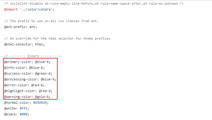
'primary-color': variables.mainColor,
'info-color': variables.mainColor,
'success-color': variables.greenColor,
'processing-color': variables.mainColor,
'error-color': variables.redColor,
'highlight-color': variables.redColor,
'warning-color': variables.orangeColor
},
// DO NOT REMOVE THIS LINE
javascriptEnabled: true
}
}
},
configureWebpack: (config) => {
config.plugins.push(ThemeColorReplacerPlugin)
},
pluginOptions: {
'style-resources-loader': {
preProcessor: 'less',
// 自动引入全局less
patterns: [
resolve(
__dirname,
'node_modules/ant-design-vue/lib/style/color/colorPalette.less'
),
resolve(__dirname, 'src/styles/variables.less')
]
}
}
}配置讲解
因为项目中 Ant 自定义主题是通过 modifyVars 方式配置,但是又不想同时在项目中多处地方写同一个颜色,所以自己写了个 getVaribles 方法,读取目录下面的 variables.less 文件,转换得到想要得数据在 modifyVars 中使用。
其中 getAntdSerials 方法和官方 Admin 平台的代码基本上一致,区别在于 rgb 颜色,因为项目代码很多地方使用了 Less 提供的 fade 方法,将颜色转换成百分比,即 rgba 带透明度的颜色,所以额外处理了下 generate 生成的颜色都转了下 rgb。 ThemeColorReplacerPlugin 插件配置也基本一致,唯一不同的是 matchColors 参数,因为项目需要多个颜色配置换肤,写了个 getMatchColors 方法,将 mainColor、greenColor 等颜色按顺序生成色值列表。
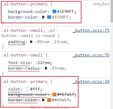
changeSelector 中基本不变,如果出现颜色被覆盖的情况,可以通过该方法解决。 比如未禁用状态下选中的 Checkbox,.ant-checkbox-checked .ant-checkbox-inner 下面有个 background-color 和 border-color。
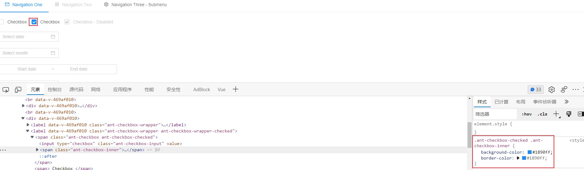
禁用状态下会有个 disabled 样式颜色覆盖原来的颜色。
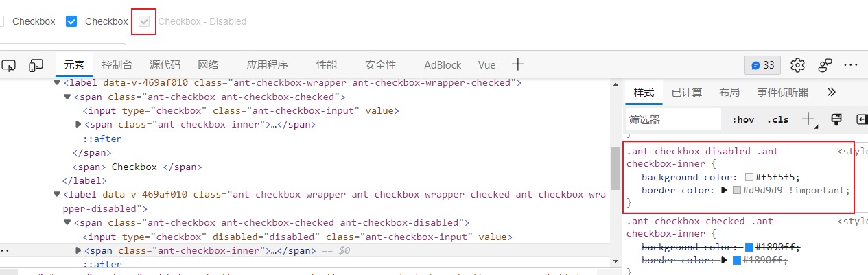
但是换色后该插件会匹配到.ant-checkbox-checked .ant-checkbox-inner 下面有需要换色的颜色,生成的内联 style 样式会插入到 body 后面,导致这个 class 的优先级会很高,会覆盖掉 disabled 的样式,可以很清楚的看到蓝色框出来的是原有的样式,灰色框出来的是禁用的样式,红色框出来的是原有样式按新颜色重新生成的,优先级会比 disabled 的样式要高,这不是我们想要的,此时很明显就是样式是冲突了。
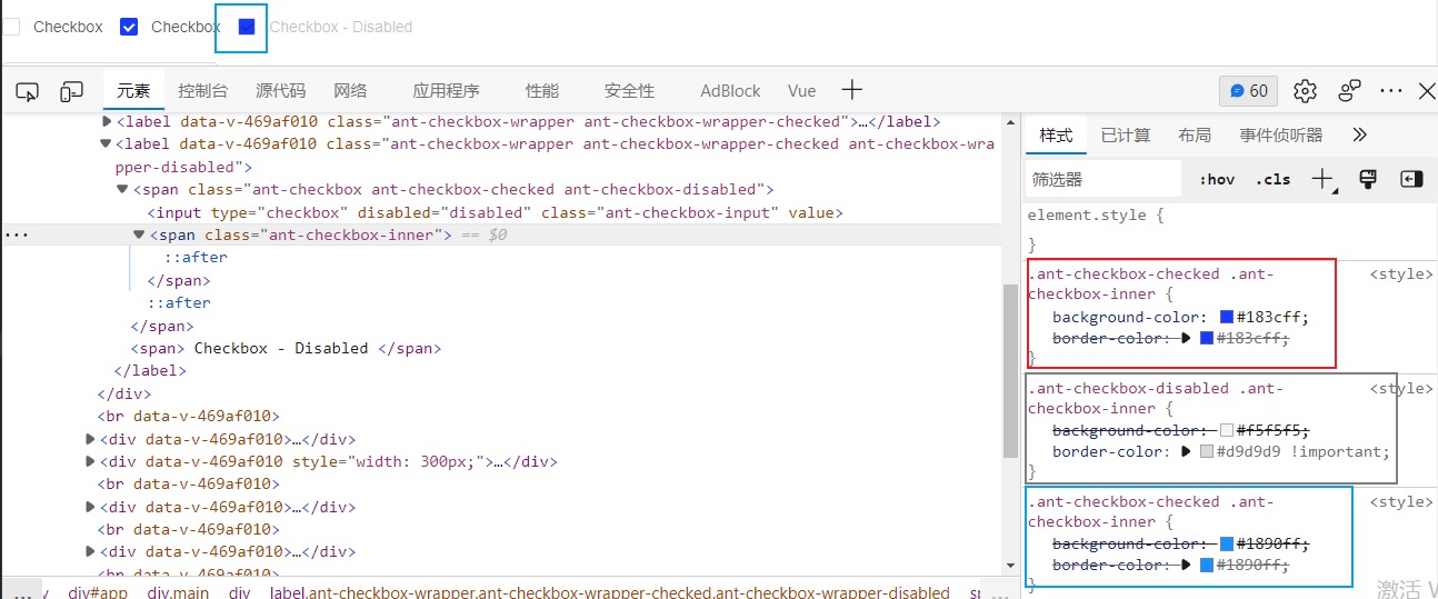
解决冲突就需要借助 changeSelector,需要排除掉 disabled 样式的 class,可以通过匹配.ant-checkbox-checked .ant-checkbox-inner,返回一个新的 class 样式排除掉 disabled 样式,这样就不会有冲突了。
case '.ant-checkbox-checked .ant-checkbox-inner':
  return '.ant-checkbox-checked:not(.ant-checkbox-disabled) .ant-checkbox-inner'
调用配置
以上的配置主要是给插件的的 matchColors 做准备的,此时还需要页面上调用换色的方法,可以直接把 Ant Admin 里面的 themeColor.js 拿过来稍微按 vue.config.js 里面配置同逻辑稍微修改下即可。
import client from 'webpack-theme-color-replacer/client'
import generate from '@ant-design/colors/lib/generate'

export default {
  getAntdSerials(color) {
    // 淡化(即less的tint)
    const lightens = new Array(9).fill().map((t, i) => {
      return client.varyColor.lighten(color, i / 10)
    })
    // colorPalette变换得到颜色值
    const colorPalettes = generate(color)
    const rgbColors = colorPalettes.map((item) =>
      client.varyColor.toNum3(item.replace('#', '')).join(',')
    )
    return [...lightens, ...colorPalettes, ...rgbColors]
  },
  changeColor(colorsMap) {
    let newColors = []
    // 颜色顺序需要和matchColors严格一致
    const colorNames = ['mainColor', 'greenColor', 'orangeColor', 'redColor']
    colorNames.map((name) => {
      newColors = [...newColors, ...this.getAntdSerials(colorsMap[name])]
    })
    const options = {
      newColors // new colors array, one-to-one corresponde with `matchColors`
    }
    return client.changer.changeColor(options, Promise)
  }
}
可以看到 getAntdSerials 方法和 vue.config.js 里面的基本一致,changeColor 方法接受一个颜色 Map 对象,该对象可以在本地维护或者配置在数据里面,如下形式:
{
  mainColor: 'xxx',
  greenColor: 'xxx',
  orangeColor: 'xxx',
  redColor: 'xxx'
  // 其他颜色
}
里面的内容基本和 vue.config.js 中的 getMatchColors 类似,按顺序生成相关颜色的列表,该列表颜色顺序需要和 matchColors 配置的颜色顺序严格保持一致。
最后可以在 util 里面写个通用的方法 updateTheme 调用 changeColor 即可。
import themeColor from './themeColor.js'
export const updateTheme = (colorsMap) => {
  themeColor.changeColor(colorsMap).finally(() => {
    // 切换完成可以做些其他操作,比如弹个提示切换成功
  })
}
示例 Demo
提示
Demo 比较粗糙,未做颜色的校验,会出现同一种颜色切换的时候换色异常问题。
Demo 项目地址:点击查看
Demo 预览:点击查看
结语
最后说说该方案的缺点,因为插件 webpack-theme-color-replacer 是根据 matchColors 颜色去匹配相关颜色的 class,然后根据 class 生成一套新的颜色样式覆盖原来的样式。
- 缺点 1:匹配的颜色不能有重复,比如主色 mainColor,绿色 greenColor 是不能够配置同样的色值的,包括衍生出来的色值也不能有重复的,不然匹配颜色替换的时候会出问题,解决方法是可以使用 2 个色值相近肉眼无法分辨差异的颜色。
- 缺点 2:无法替换元素 style 样式的颜色,比如下方这种形式,插件是无法替换主色#1890ff 的,解决方法是取消在元素 style 中指定需要变换的颜色,用 class 去代替颜色设置。
综上所述在实际项目中,配置的配色方案需要严格校验相关颜色是否有重复。
 Cloudflare
 1Panel
 VuePress
 VuePress Theme Hope