- 本文链接:Naive UI 动态自定义换肤实现
- 版权声明: 本博客所有文章除特别声明外,均采用
BY-NC-SA 许可协议,转载请注明出处!
Naive UI 动态自定义换肤实现
2023/7/8大约 11 分钟
Naive UI 动态自定义换肤实现
之前因为项目需要,实现了 Ant Vue 的自定义换肤并记录了下实现过程Ant Vue 1.x 动态自定义换肤,后来新项目采用Naive UI,也就自己摸索着实现一下自定义换肤,顺便自己记录一下。
思路分析
自定义换肤一般都优先查看文档中的调整主题,文档说明可以通过设定 n-config-provider 的 theme-overrides 来调整主题变量,如下所示:
<script lang="ts">
import { NConfigProvider, GlobalThemeOverrides } from 'naive-ui'

const themeOverrides: GlobalThemeOverrides = {
  common: {
    primaryColor: '#FF0000'
  },
  Button: {
    textColor: '#FF0000'
  }
}
// ...
</script>

<template>
  <n-config-provider :theme-overrides="themeOverrides">
    <my-app />
  </n-config-provider>
</template>通过上面的代码可以得知全局通用的样式可以在themeOverrides.common中指定,如上所示的primaryColor,而且themeOverrides中还支持按组件单独设置样式,如Button,这里我们可以忽略组件样式的单独设置,只需要关注common即可。
themeOverrides.common支持配置哪些主题变量,可以通过创建适配主题的组件文档中useThemeVars说明,里面包含了常见的主题变量。
点击查看主题变量
{
  "name": "common",
  "fontFamily": "v-sans, system-ui, -apple-system, BlinkMacSystemFont, \"Segoe UI\", sans-serif, \"Apple Color Emoji\", \"Segoe UI Emoji\", \"Segoe UI Symbol\"",
  "fontFamilyMono": "v-mono, SFMono-Regular, Menlo, Consolas, Courier, monospace",
  "fontWeight": "400",
  "fontWeightStrong": "500",
  "cubicBezierEaseInOut": "cubic-bezier(.4, 0, .2, 1)",
  "cubicBezierEaseOut": "cubic-bezier(0, 0, .2, 1)",
  "cubicBezierEaseIn": "cubic-bezier(.4, 0, 1, 1)",
  "borderRadius": "3px",
  "borderRadiusSmall": "2px",
  "fontSize": "14px",
  "fontSizeMini": "12px",
  "fontSizeTiny": "12px",
  "fontSizeSmall": "14px",
  "fontSizeMedium": "14px",
  "fontSizeLarge": "15px",
  "fontSizeHuge": "16px",
  "lineHeight": "1.6",
  "heightMini": "16px",
  "heightTiny": "22px",
  "heightSmall": "28px",
  "heightMedium": "34px",
  "heightLarge": "40px",
  "heightHuge": "46px",
  "baseColor": "#FFF",
  "primaryColor": "#18a058",
  "primaryColorHover": "#36ad6a",
  "primaryColorPressed": "#0c7a43",
  "primaryColorSuppl": "#36ad6a",
  "infoColor": "#2080f0",
  "infoColorHover": "#4098fc",
  "infoColorPressed": "#1060c9",
  "infoColorSuppl": "#4098fc",
  "successColor": "#18a058",
  "successColorHover": "#36ad6a",
  "successColorPressed": "#0c7a43",
  "successColorSuppl": "#36ad6a",
  "warningColor": "#f0a020",
  "warningColorHover": "#fcb040",
  "warningColorPressed": "#c97c10",
  "warningColorSuppl": "#fcb040",
  "errorColor": "#d03050",
  "errorColorHover": "#de576d",
  "errorColorPressed": "#ab1f3f",
  "errorColorSuppl": "#de576d",
  "textColorBase": "#000",
  "textColor1": "rgb(31, 34, 37)",
  "textColor2": "rgb(51, 54, 57)",
  "textColor3": "rgb(118, 124, 130)",
  "textColorDisabled": "rgba(194, 194, 194, 1)",
  "placeholderColor": "rgba(194, 194, 194, 1)",
  "placeholderColorDisabled": "rgba(209, 209, 209, 1)",
  "iconColor": "rgba(194, 194, 194, 1)",
  "iconColorHover": "rgba(146, 146, 146, 1)",
  "iconColorPressed": "rgba(175, 175, 175, 1)",
  "iconColorDisabled": "rgba(209, 209, 209, 1)",
  "opacity1": "0.82",
  "opacity2": "0.72",
  "opacity3": "0.38",
  "opacity4": "0.24",
  "opacity5": "0.18",
  "dividerColor": "rgb(239, 239, 245)",
  "borderColor": "rgb(224, 224, 230)",
  "closeIconColor": "rgba(102, 102, 102, 1)",
  "closeIconColorHover": "rgba(102, 102, 102, 1)",
  "closeIconColorPressed": "rgba(102, 102, 102, 1)",
  "closeColorHover": "rgba(0, 0, 0, .09)",
  "closeColorPressed": "rgba(0, 0, 0, .13)",
  "clearColor": "rgba(194, 194, 194, 1)",
  "clearColorHover": "rgba(146, 146, 146, 1)",
  "clearColorPressed": "rgba(175, 175, 175, 1)",
  "scrollbarColor": "rgba(0, 0, 0, 0.25)",
  "scrollbarColorHover": "rgba(0, 0, 0, 0.4)",
  "scrollbarWidth": "5px",
  "scrollbarHeight": "5px",
  "scrollbarBorderRadius": "5px",
  "progressRailColor": "rgba(235, 235, 235, 1)",
  "railColor": "rgb(219, 219, 223)",
  "popoverColor": "#fff",
  "tableColor": "#fff",
  "cardColor": "#fff",
  "modalColor": "#fff",
  "bodyColor": "#fff",
  "tagColor": "#eee",
  "avatarColor": "rgba(204, 204, 204, 1)",
  "invertedColor": "rgb(0, 20, 40)",
  "inputColor": "rgba(255, 255, 255, 1)",
  "codeColor": "rgb(244, 244, 248)",
  "tabColor": "rgb(247, 247, 250)",
  "actionColor": "rgb(250, 250, 252)",
  "tableHeaderColor": "rgb(250, 250, 252)",
  "hoverColor": "rgb(243, 243, 245)",
  "tableColorHover": "rgba(0, 0, 100, 0.03)",
  "tableColorStriped": "rgba(0, 0, 100, 0.02)",
  "pressedColor": "rgb(237, 237, 239)",
  "opacityDisabled": "0.5",
  "inputColorDisabled": "rgb(250, 250, 252)",
  "buttonColor2": "rgba(46, 51, 56, .05)",
  "buttonColor2Hover": "rgba(46, 51, 56, .09)",
  "buttonColor2Pressed": "rgba(46, 51, 56, .13)",
  "boxShadow1": "0 1px 2px -2px rgba(0, 0, 0, .08), 0 3px 6px 0 rgba(0, 0, 0, .06), 0 5px 12px 4px rgba(0, 0, 0, .04)",
  "boxShadow2": "0 3px 6px -4px rgba(0, 0, 0, .12), 0 6px 16px 0 rgba(0, 0, 0, .08), 0 9px 28px 8px rgba(0, 0, 0, .05)",
  "boxShadow3": "0 6px 16px -9px rgba(0, 0, 0, .08), 0 9px 28px 0 rgba(0, 0, 0, .05), 0 12px 48px 16px rgba(0, 0, 0, .03)"
}通过上述的主题颜色变量和源码_styles/common/light.ts,我们可以很清楚的知道主题颜色通过下面的几个颜色变量控制的。
{
  // 主题色相关
  "primaryColor": "#18a058",
  "primaryColorHover": "#36ad6a",
  "primaryColorPressed": "#0c7a43",
  "primaryColorSuppl": "#36ad6a",

  // Info颜色相关
  "infoColor": "#2080f0",
  "infoColorHover": "#4098fc",
  "infoColorPressed": "#1060c9",
  "infoColorSuppl": "#4098fc",

  // Success颜色相关
  "successColor": "#18a058",
  "successColorHover": "#36ad6a",
  "successColorPressed": "#0c7a43",
  "successColorSuppl": "#36ad6a",

  // Warning颜色相关
  "warningColor": "#f0a020",
  "warningColorHover": "#fcb040",
  "warningColorPressed": "#c97c10",
  "warningColorSuppl": "#fcb040",

  // Error颜色相关
  "errorColor": "#d03050",
  "errorColorHover": "#de576d",
  "errorColorPressed": "#ab1f3f",
  "errorColorSuppl": "#de576d"
}所以我们自定义主题的时候只需要通过theme-overrides传入这些颜色的变量即可。
颜色获取
好在 Naive UI 颜色变量比较简洁,每种颜色只需要定义 4 个变量即可,我们完全可以通过定义 4 个不同的颜色来达到目的,但是通常我们需要学会“偷懒”,借助其他方法来定义一个颜色,分别获取另外的ColorHover ColorPressed ColorSuppl颜色。这里可以通过之前用到的ant-design-colors工具,用过 Ant 的应该都知道,Ant Design 整体色系也是由该工具生成的,具体颜色说明可以参考 Ant Design 官网文档说明。
该工具的使用方法也很简单,通过引入generate方法,传入一个颜色变量,可以生成由淡到深的 10 种颜色。
import { generate } from '@ant-design/colors'

const colors = generate('#1890ff')
console.log(colors) // ['#E6F7FF', '#BAE7FF', '#91D5FF', ''#69C0FF', '#40A9FF', '#1890FF', '#096DD9', '#0050B3', '#003A8C', '#002766']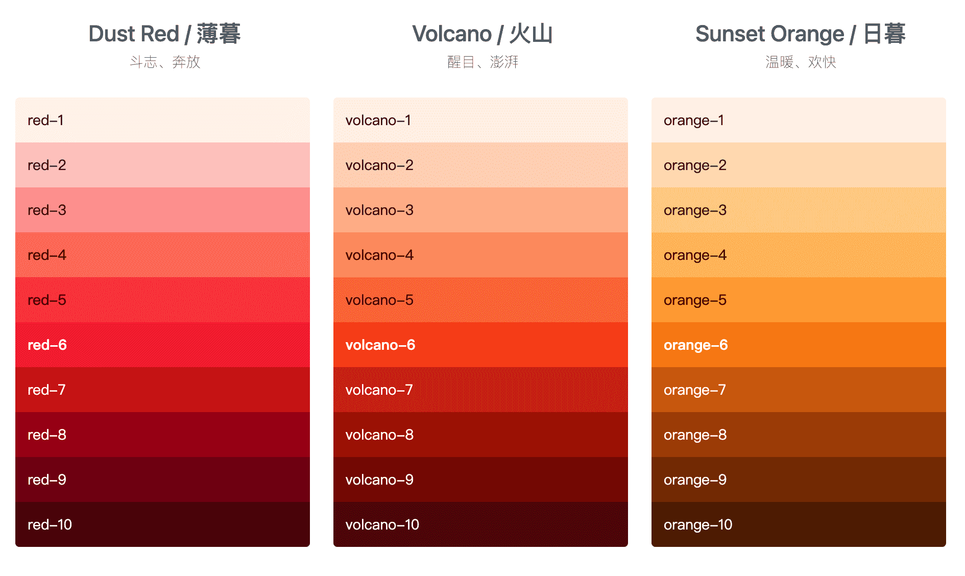
下面以主题色primaryColor获取为例,其他颜色同理。设置主题色的时候我们通常只需要定义一个颜色,通过generate生成其他颜色,参考 Ant Design 官网的规律,generate生成的 10 个颜色中第 6 个是传入的颜色,Hover 颜色比主色谈一个档次,可以取第 5 个颜色,Native UI 的 Suppl 颜色和 Hover 颜色一致,Pressed 是点击后的颜色,比主色深一个档次,可以取第 7 个颜色。
const colors = generate('#1890ff')

const primaryColor = colors[5] // 主色取第6个颜色,和传入的颜色一致
const primaryColorHover = colors[4] // Hover和Suppl颜色一样,取第5个颜色
const primaryColorSuppl = colors[4] // Hover和Suppl颜色一样,取第5个颜色
const primaryColorPressed = colors[6] // 比主色深一档,取第7个颜色
这样我们就能通过一个颜色获取到其他相关的颜色。
简单 Demo 实现
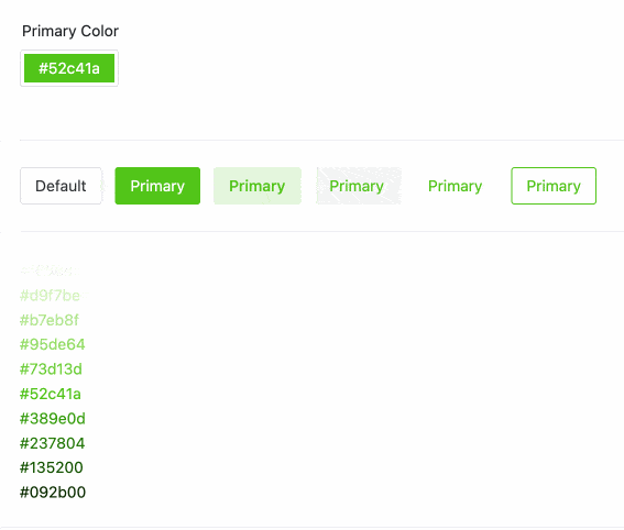
按照以上的想法,我们可以先写一个简单的 Demo,用于主题色的换肤动态切换。
<template>
  <n-config-provider :theme-overrides="themeOverrides">
    <n-card>
      <n-row gutter="12">
        <n-form inline>
          <n-col :span="4">
            <n-form-item label="Primary Color">
              <n-color-picker
                v-model:value="primaryColor"
                :show-alpha="false"
              />
            </n-form-item>
          </n-col>
        </n-form>
      </n-row>
      <n-divider />
      <n-space>
        <n-space>
          <n-button>Default</n-button>
          <n-button type="primary"> Primary </n-button>
          <n-button strong secondary type="primary"> Primary </n-button>
          <n-button tertiary type="primary"> Primary </n-button>
          <n-button quaternary type="primary"> Primary </n-button>
          <n-button type="primary" ghost> Primary </n-button>
        </n-space>
      </n-space>
      <n-divider />
      <div v-for="color in generateColors" :key="color" :style="{ color }">
        {{ color }}
      </div>
    </n-card>
  </n-config-provider>
</template>

<script lang="ts" setup>
import { ref, watch } from 'vue'
import { generate } from '@ant-design/colors'
import { type GlobalThemeOverrides } from 'naive-ui'

// 定义一个主色
const primaryColor = ref('#52c41a')
// theme-overrides
const themeOverrides = ref<GlobalThemeOverrides>({})
// generate生成的颜色
const generateColors = ref<string[]>([])

setThemeOverrides()

// 设置theme-overrides
function setThemeOverrides() {
  generateColors.value = generate(primaryColor.value)
  const commonColors = {
    primaryColor: generateColors.value[5],
    primaryColorHover: generateColors.value[4],
    primaryColorSuppl: generateColors.value[4],
    primaryColorPressed: generateColors.value[6]
  }
  themeOverrides.value.common = commonColors
}

// 监听主色变化
watch(primaryColor, () => {
  setThemeOverrides()
})
</script>
简单 Demo 预览
暗黑模式适配
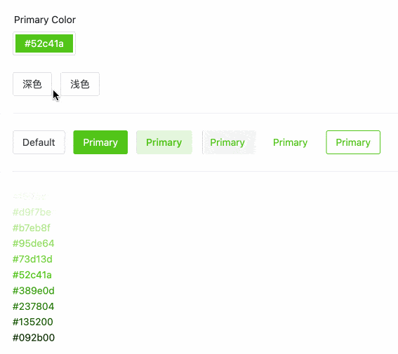
Naive UI 是支持暗黑模式的,所以换肤后也是需要进行暗黑模式的适配,我们可以参考文档中的不同主题下调整主题变量,theme-overrides根据theme的不同传入正常颜色和暗黑颜色,添加深色和浅色按钮,用于演示。
<template>
  <n-config-provider :theme="theme" :theme-overrides="themeOverrides">
    <n-card>
      <n-row gutter="12">
        <n-form inline>
          <n-col :span="4">
            <n-form-item label="Primary Color">
              <n-color-picker
                v-model:value="primaryColor"
                :show-alpha="false"
              />
            </n-form-item>
          </n-col>
        </n-form>
      </n-row>
      <n-space>
        <n-button @click="theme = darkTheme">深色</n-button>
        <n-button @click="theme = null">浅色</n-button>
      </n-space>
      <n-divider />
      <n-space>
        <n-space>
          <n-button>Default</n-button>
          <n-button type="primary"> Primary </n-button>
          <n-button strong secondary type="primary"> Primary </n-button>
          <n-button tertiary type="primary"> Primary </n-button>
          <n-button quaternary type="primary"> Primary </n-button>
          <n-button type="primary" ghost> Primary </n-button>
        </n-space>
      </n-space>
      <n-divider />
      <div v-for="color in generateColors" :key="color" :style="{ color }">
        {{ color }}
      </div>
    </n-card>
  </n-config-provider>
</template>

<script lang="ts" setup>
import { ref, watch } from 'vue'
import { generate } from '@ant-design/colors'
import {
  darkTheme,
  commonDark,
  type GlobalTheme,
  type GlobalThemeOverrides
} from 'naive-ui'

// 主题,null为亮色,darkTheme为暗色
const theme = ref<GlobalTheme | null>(null)
// 定义一个主色
const primaryColor = ref('#52c41a')
// theme-overrides
const themeOverrides = ref<GlobalThemeOverrides>({})
// generate生成的颜色
const generateColors = ref<string[]>([])

setThemeOverrides()

// 设置theme-overrides
function setThemeOverrides() {
  generateColors.value = theme.value
    ? generate(primaryColor.value, {
        // generate支持传入theme为dark生成暗黑色系
        theme: 'dark',
        // 暗黑色系生成的背景色,这里可以传入主题暗黑模式下的背景色
        backgroundColor: commonDark.bodyColor
      })
    : generate(primaryColor.value)

  const commonColors = {
    primaryColor: generateColors.value[5],
    primaryColorHover: generateColors.value[4],
    primaryColorPressed: generateColors.value[5],
    primaryColorSuppl: generateColors.value[6]
  }
  themeOverrides.value.common = commonColors
}

// 监听primaryColor和theme
watch([primaryColor, theme], () => {
  setThemeOverrides()
})
</script>
暗黑适配效果预览
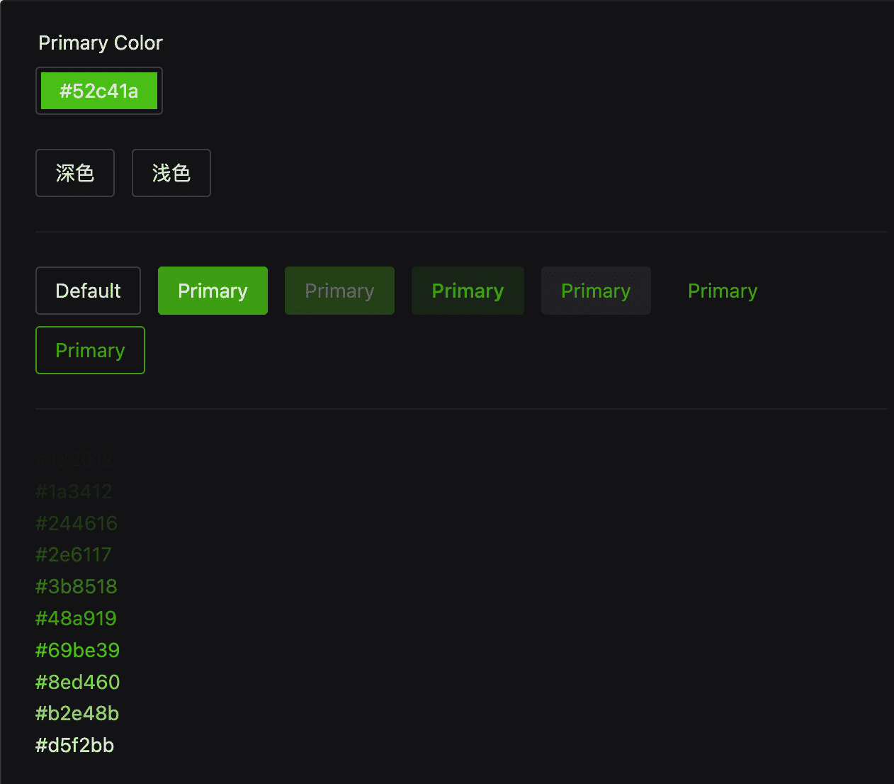
优化按钮 Primary 按钮
暗黑模式下 Primary 按钮文字是黑色的,感觉不是很协调,咋们保持和 Ant Design 的按钮一致,暗黑模式下文字也保持是白色,针对Button新增一些配置。
themeOverrides.value.common = commonColors
themeOverrides.value.Button = {
  textColorPrimary: '#fff',
  textColorHoverPrimary: '#fff',
  textColorPressedPrimary: '#fff',
  textColorFocusPrimary: '#fff',
  textColorDisabledPrimary: '#fff'
}
这样就比较完美了
优化封装
以上只是针对主色进行换肤,还需要额外支持下info、error、warning、success的颜色自定义换肤,按通用颜色区分分别是蓝色,红色、橘黄色、绿色,为了更好的调用,我们可以通过Pinia去维护管理。
ThemeStore
我们创建一个简单的ThemeStore,定义一些需要的变量和方法,下面都有注释很好理解,重点是getThemeOverrides方法的实现,上面的 Demo 我们只是实现了一个传入primaryColor实现动态换肤,getThemeOverrides需要传入一个颜色配置themeConfig,里面包含了primary info success warning error这几个类型的颜色,具体实现这里不多说了,思路和上面是一样的,代码可以参考最后的源码。
import { ref, computed } from 'vue'
import { defineStore } from 'pinia'
import { getThemeOverrides, type ThemeConfig } from './utils'
import { darkTheme } from 'naive-ui'

export const useThemeStore = defineStore('theme', () => {
  /** 暗黑模式 */
  const darkMode = ref(false)

  /** 主题配置 */
  const themeConfig = ref<ThemeConfig>({
    primary: '#18a058',
    info: '#2080f0',
    success: '#18a058',
    warning: '#f0a020',
    error: '#d03050'
  })

  /** 主题 */
  const theme = computed(() => (darkMode.value ? darkTheme : null))

  /** 主题theme-overrides */
  const themeOverrides = computed(() => {
    // 返回主题需要的ThemeOverrides,getThemeOverrides方法需要我们自己去实现
    return getThemeOverrides(themeConfig.value, darkMode.value)
  })

  /** 暗黑模式切换 */
  function toggleDarkMode() {
    darkMode.value = !darkMode.value
  }

  /** 手动设置主题 */
  function setThemeConfig(config: ThemeConfig) {
    themeConfig.value = {
      ...themeConfig.value,
      ...config
    }
  }

  return {
    darkMode,
    themeConfig,
    theme,
    themeOverrides,
    toggleDarkMode,
    setThemeConfig
  }
})
适配跟随系统
借助VueUse工具提供的useColorMode方法可以轻松实现。稍微改造下上面的内容。暗黑模式切换使用useCycleList提供的内置方法next(),依次在dark light auto循环切换,变化的值可以通过state获取到,可以将state做为modeState导出,方便其他地方使用。
import { ref, computed, watch } from 'vue'
import { defineStore } from 'pinia'
import { getThemeOverrides, type ThemeConfig } from './utils'
import { darkTheme } from 'naive-ui'
import { useColorMode, useCycleList, type BasicColorSchema } from '@vueuse/core'
export const useThemeStore = defineStore('theme', () => {
const colorMode = useColorMode({
emitAuto: true
})
const { state, next } = useCycleList(['dark', 'light', 'auto'], {
initialValue: colorMode
})
watch(
state,
() => {
colorMode.value = state.value as BasicColorSchema
},
{ immediate: true }
)
完整示例代码
https://github.com/liub1934/naive-ui-change-theme
在线预览
https://github.liubing.me/naive-ui-change-theme
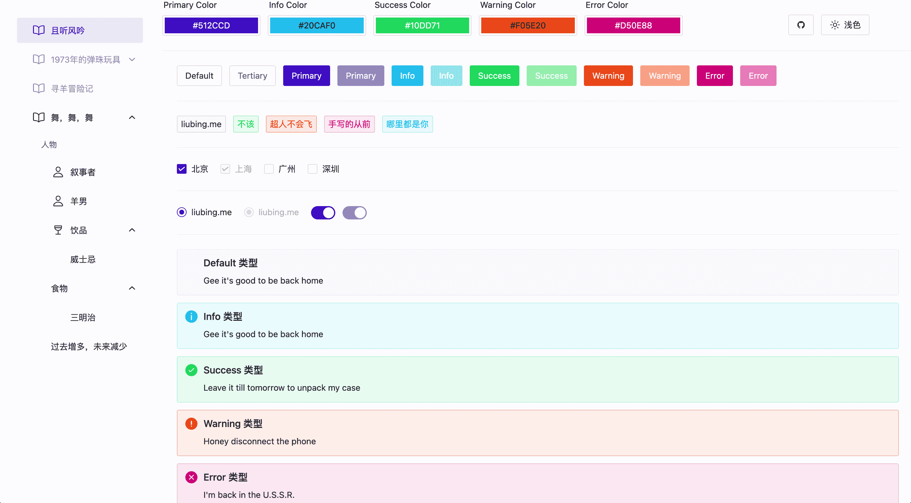
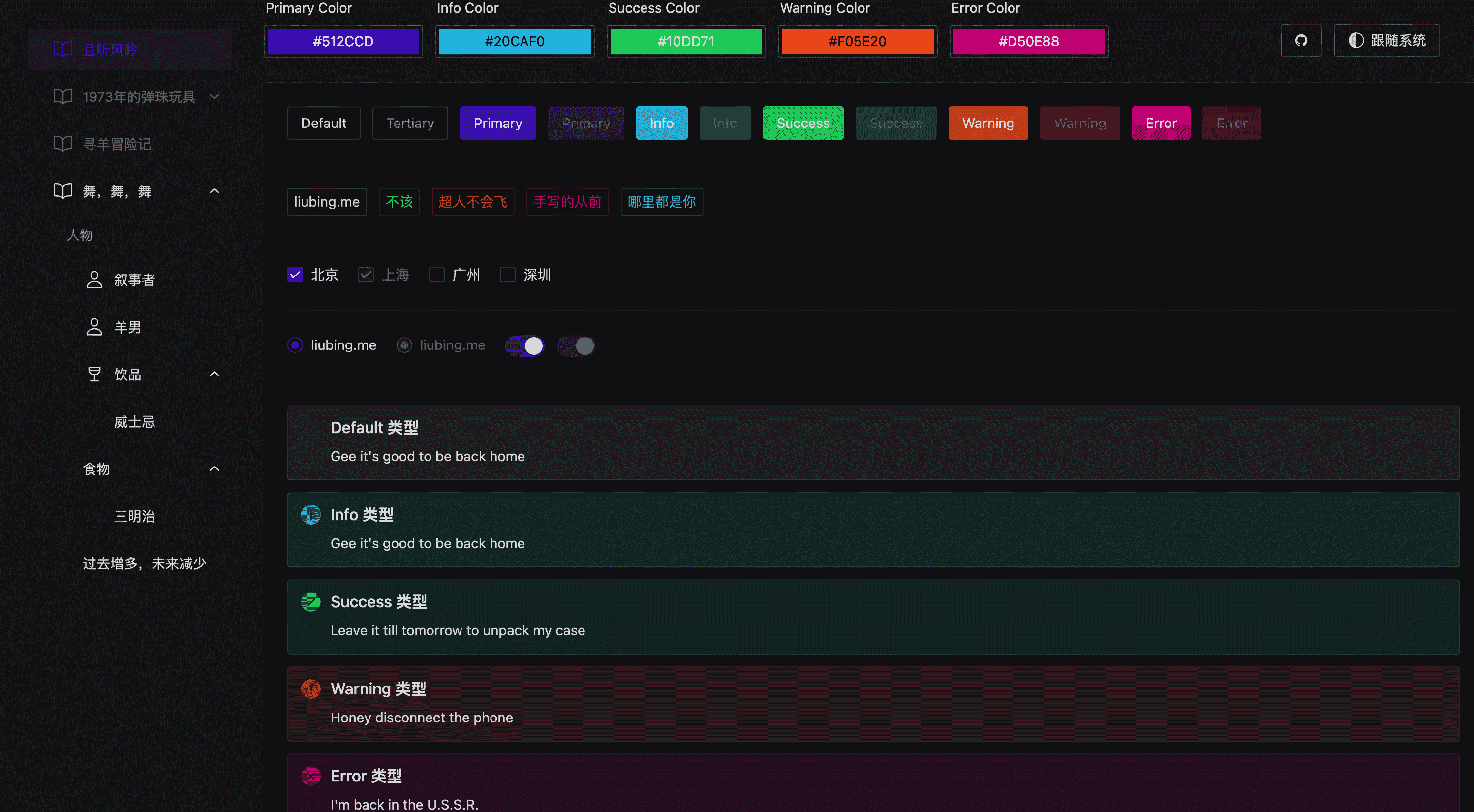
最终效果预览
搭配 UnoCSS
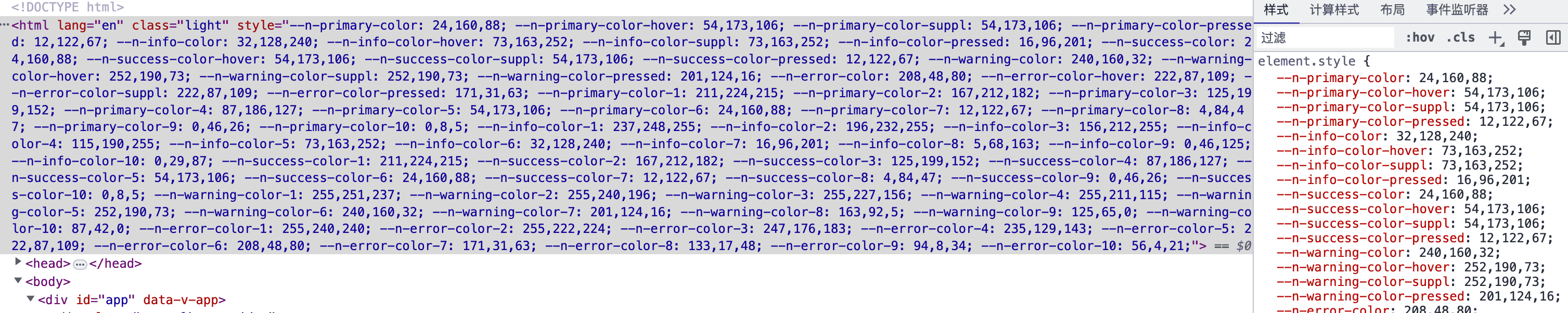
为了配合 UnoCSS 使用,这里特意通过addCssVarsToHtml方法将生成的所有变量都添加到了 Html 上。
自定义主题
可以利用 UnoCSS 提供的自定义Theme功能,在我们输入相应的颜色 class 的时候,自动生成相应的 css,比如输入color-primary,文字颜色就会变成主色,输入bg-primary,背景色就会变成主色,输入color-primary-2,文字颜色就会变成色系里面的第二个颜色,按照此规律以此类推。写法大致如下所示:
// uno.config.ts
import { defineConfig } from 'unocss'
import presetUno from '@unocss/preset-uno'
export default defineConfig({
presets: [presetUno()],
theme: {
colors: {
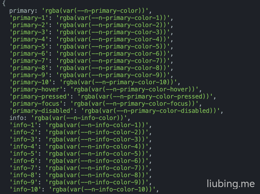
primary: 'rgba(var(--n-primary-color))',
'primary-1': 'rgba(var(--n-primary-color-1))',
'primary-2': 'rgba(var(--n-primary-color-2))',
'primary-3': 'rgba(var(--n-primary-color-3))',
// ...
'primary-10': 'rgba(var(--n-primary-color-10))',
'primary-hover': 'rgba(var(--n-primary-color-hover))',
'primary-pressed': 'rgba(var(--n-primary-color-pressed))',
'primary-focus': 'rgba(var(--n-primary-color-focus))',
'primary-disabled': 'rgba(var(--n-primary-color-disabled))'
// ...其他
}
}
})会发现需要定义的colors内容太多了,这里我们可以偷懒点,写一个方法,根据primary info success warning error搭配hover pressed focus disabled生成这一系列颜色。
function generateColorCombinations(): Record<string, string> {
  const colorTypes = ['primary', 'info', 'success', 'warning', 'error']
  const colorScenes = ['hover', 'pressed', 'focus', 'disabled']
  const result: Record<string, string> = {}
  for (const type of colorTypes) {
    result[type] = `rgba(var(--n-${type}-color))`
    for (let i = 1; i <= 10; i++) {
      result[`${type}-${i}`] = `rgba(var(--n-${type}-color-${i}))`
    }
    for (const scene of colorScenes) {
      result[`${type}-${scene}`] = `rgba(var(--n-${type}-color-${scene}))`
    }
  }
  return result
}
可以执行下看下输出的结果,是我们想要的变量。
最后将输出的内容放到theme.colors里面
// uno.config.ts
import { defineConfig } from 'unocss'
import presetUno from '@unocss/preset-uno'

function generateColorCombinations(): Record<string, string> {
  const colorTypes = ['primary', 'info', 'success', 'warning', 'error']
  const colorScenes = ['hover', 'pressed', 'focus', 'disabled']
  const result: Record<string, string> = {}
  for (const type of colorTypes) {
    result[type] = `rgba(var(--n-${type}-color))`
    for (let i = 1; i <= 10; i++) {
      result[`${type}-${i}`] = `rgba(var(--n-${type}-color-${i}))`
    }
    for (const scene of colorScenes) {
      result[`${type}-${scene}`] = `rgba(var(--n-${type}-color-${scene}))`
    }
  }
  return result
}

export default defineConfig({
  presets: [presetUno()],
  theme: {
    colors: {
      // 生成如下颜色数据
      // 'primary': 'rgba(var(--n-primary-color))'
      // 'primary-1': 'rgba(var(--n-primary-color-1))',
      // 'primary-hover': 'rgba(var(--n-primary-color-hover))',
      // ...其他
      ...generateColorCombinations()
    }
  }
})
示例
支持 color、background-color、border-color 等等及透明度。
<div class="color-primary"></div>
<!--
.color-primary {
  --un-text-opacity: 1;
  color: rgba(var(--n-primary-color), var(--un-text-opacity));
}
-->

<div class="color-primary-1"></div>
<!--
.color-primary-1 {
  --un-text-opacity: 1;
  color: rgba(var(--n-primary-color-1), var(--un-text-opacity));
}
-->

<!-- 透明度支持 -->
<div class="color-primary/50"></div>
<!--
.color-primary\/50 {
    color: rgba(var(--n-primary-color), 0.5);
}
--> Cloudflare
 1Panel
 VuePress
 VuePress Theme Hope